love this ad
Friday 14 January 2011
Thursday 6 January 2011
Final layout
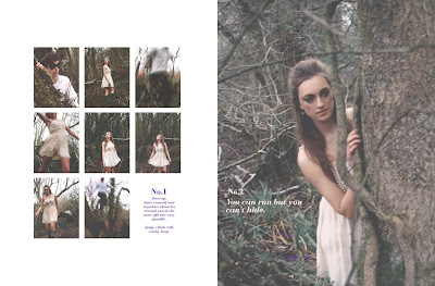
Decided to keep it simple and let the photographs speak for themselves.
The printing didn't go brilliantly, there is a red glow over the images which doesnt look great but i cant face doing it again! the digital versions look alot better.


The printing didn't go brilliantly, there is a red glow over the images which doesnt look great but i cant face doing it again! the digital versions look alot better.


Wednesday 5 January 2011
Shufti
Here are a few of my favourite photographs from the shoot.
Ive had a play around on photoshop with the levels and hues but i think the most successful tones are the muted ones - like how they seem a bit dreamy and natural.
Big thankyou to my gorgeous models, Camilla and Adam - they braved the cold and my somewhat developing photography skills very well!


Ive had a play around on photoshop with the levels and hues but i think the most successful tones are the muted ones - like how they seem a bit dreamy and natural.
The theme ive chosen is 'Parkour'. I've taking a different approach to the sport making it feminine and portraying it as a fantasy game for women to play. Going to have a play around with the layout today but to celebrate the Shufti 10 edition, the magazine will take you through a series of photographs and 1 -10 rules of the Parkour game. Meant to be a bit of fun and basically illustrate the girls romantic fantasy as she is chased by a hansom masked man, the last spread will reveal him taking off his mask showing that they are infact lovers.
Big thankyou to my gorgeous models, Camilla and Adam - they braved the cold and my somewhat developing photography skills very well!


Thursday 25 November 2010
facebook breakups

This is brilliant.
from informationisbeautiful.net a comic yet truthful diagram of the
facebook relationship statuses across the year!
Wednesday 28 July 2010
A little bit of comedy
Ok, so I know its not exactly design news, however a friend sent me this and its just too good to not be posted!
I find spoof videos and photographs create alot of attention as they have a strong sense of clever wit making them memorable and quite simply hilarious!
I find spoof videos and photographs create alot of attention as they have a strong sense of clever wit making them memorable and quite simply hilarious!
Thursday 22 July 2010
Italian Vogue trumps the UK's issues

A friend of mine has been doing work experience at the London vogue office and aswell as hearing about some of the amazing things she has done, she was lovely enough to grab be some freebies.
Ive got a copy of this seasons English Vogue and the current Italia issue and I have to say the difference is remarkable.
Even without a word of Italian to my vocabulary, I was so much more engaged with the foreign copy. The layouts are more lavish and experimental, the photography richer, and the typography even more glamourous. Compared our home copy is dull and not too distinguishing from any other fashion glossy! Dont get me wrong, I am still a regular reader, but for me it is beginning to loose its element of exclusivity. Instead I am starting to tire of the same old advertisements which saturate my visual world.
Italy does have an incredible reputation of being that but more extravagant, and this is summed up in the monthly D.P pages, a contribution of the fashion world by Anna Piaggi, a designer i have been an avid fan of for years.
Her pages always appear so effortless yet unique, noticing the smallest trend on the catwalk she produces these amazing spreads which capture the idea in incredible layouts, typography and illustrations.
Why cant the UK issues live up to these standards and become the designer magazine it once was!?
Tuesday 20 July 2010
The Real Olympic Brief
Having endured a whole semester working on our University 2012 Olympic brief, the GB basketball team has now become the focus of a digital campaign to raise awareness and gain support for the sport during the lead up to the games. It will be very interesting to see the success of the campaign as comparing the professional project to some of our small scale ideas will give or hinder some confidence and see a similar digital campaign live!

The design agency, Albion, have created an online community encouraging the Great British public to support the team as they are the only ones not automatically qualifying for the London games. The website has a very united and encouraging feel; a strategy making the public feel the decision is a injustice therefore needs to show support! (loving the guilt trip)
Have a look at the Back British Basketball website they have designed. Its full of Blogs, information, Tshirts and general ploys to support the GB team as they strive to do well.
Have a look at the Back British Basketball website they have designed. Its full of Blogs, information, Tshirts and general ploys to support the GB team as they strive to do well.
...Having seen most of my fellow designers outcomes, I am yet to find anything outstandingly amazing about Albion's campaign both in delivery and content.
They have set aims which they want the sport to reach, (their 10 commandments) which does I suppose give the public a target to reaching support, in this way they can see the direct effects of their efforts to help the team. Quite a clever tactic!

Subscribe to:
Posts (Atom)
About Me
- HannahB
- I'm Hannah and this is my Design Blog. Im a second year Graphic Design student at the University of Leeds so feel free to have a look around my site and please give as much feed back as you want!